

Designing a Clinician-Facing Neurotech Platform
Designing a Clinician-Facing Neurotech Platform
Designing a Clinician-Facing Neurotech Platform
TIMELINE
TIMELINE
TIMELINE
June 2026 – August 2026
June 2026 – August 2026
June 2026 – August 2026
ROLE
ROLE
User Experience Intern
3 Software Engineers
2 Product Owners
2 Business Managers
Me as the sole UX Designer
Sole UX Designer
SKILLS
SKILLS
SKILLS
UX Audit, Design Systems, Prototyping
UX Audit, Design Systems, Prototyping
OVERVIEW
OVERVIEW
OVERVIEW
Vielight is a Startup that Builds Brain Therapy Headset Devices using EEG and Photobiomodulation.
Vielight is a Startup that Builds Brain Therapy Headset Devices using EEG and Photobiomodulation.
I joined Vielight as the only dedicated designer on a small NeuroAI team with 3 AI engineers.
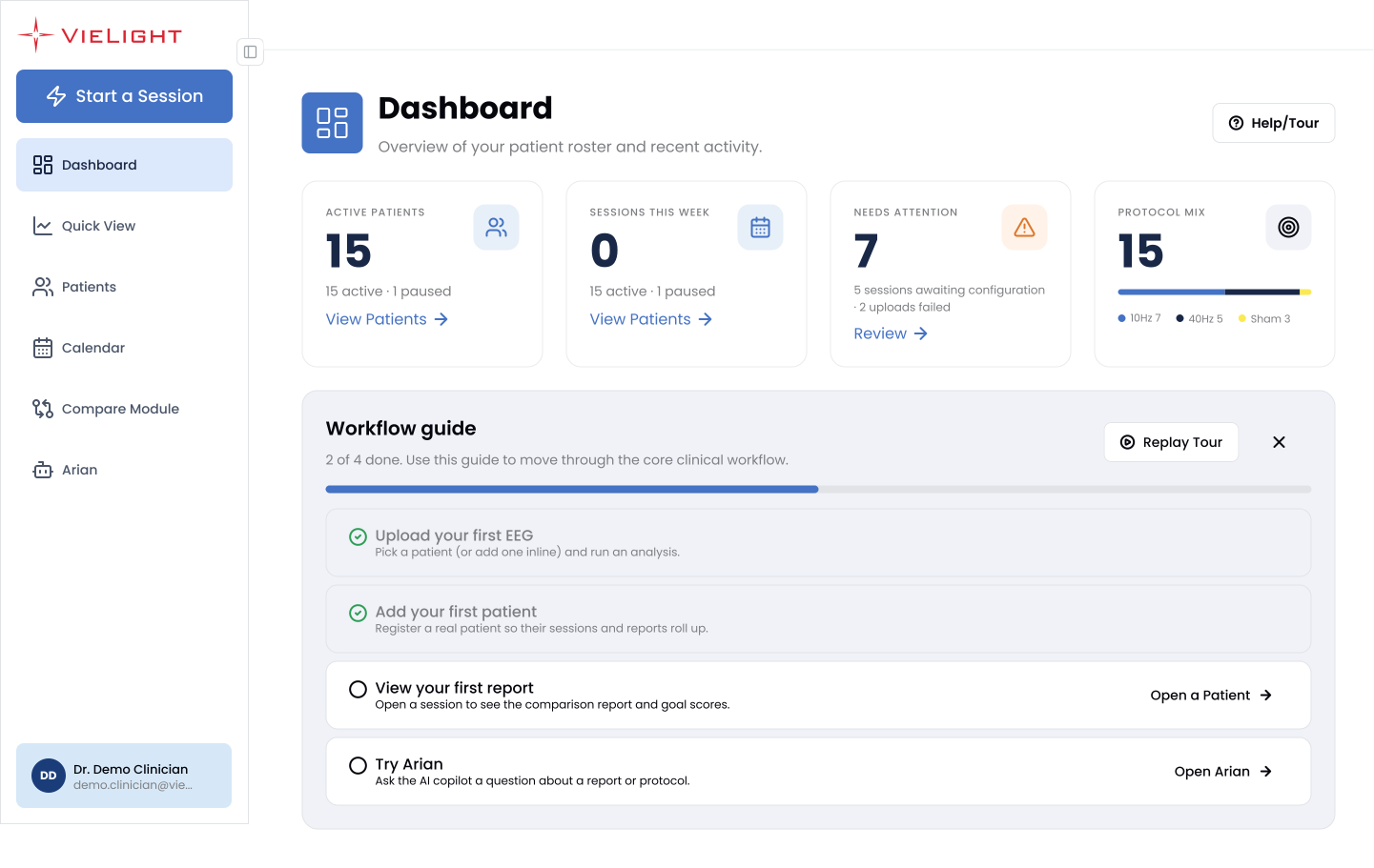
I was tasked with redesigning the clinician platform, which a clinician would use to:
Register patients
Run sessions
Review EEG recordings
Read the resulting brain data.
My goal was to make the clinician experience implementation-ready before the platform's first public demo.
I joined Vielight as the only dedicated designer on a small NeuroAI team with 3 AI engineers.
I was tasked with redesigning the clinician platform, which a clinician would use to:
Register patients
Run sessions
Review EEG recordings
Read the resulting brain data.
My goal was to make the clinician experience implementation-ready before the platform's first public demo.
I joined Vielight as the only dedicated designer on a small NeuroAI team with 3 AI engineers.
I was tasked with redesigning the clinician platform, which a clinician would use to:
Register patients
Run sessions
Review EEG recordings
Read the resulting brain data.
My goal was to make the clinician experience implementation-ready before the platform's first public demo.

I guided the work into four areas for the first release:
I guided the work into four areas for the first release:
I guided the work into four areas for the first release:
I guided the work into four areas for the first release:
1
1
Design System Foundation
Design System Foundation
🏛️
Standardized tokens, components, and icons across the platform.
Standardized tokens, components, and icons across the platform.
Standardized tokens, components, and icons across the platform.
2
2
Session & Recording Flow
Session & Recording Flow
🧠
Simplified how clinicians create sessions, upload EEG data, and review recordings.
Conducted all relevant UX Research & Design work as the sole designer.
Simplified how clinicians create sessions, upload EEG data, and review recordings.
Simplified how clinicians create sessions, upload EEG data, and review recordings.
3
3
Visualization Language
Visualization Language
📊
Unified 2D/3D brain views and comparison modules into one clinical language.
Unified 2D/3D brain views and comparison modules into one clinical language.
Unified 2D/3D brain views and comparison modules into one clinical language.
4
4
Public Landing Page
Public Landing Page
🌐
Embedded a data-informed culture by presenting objective research findings.
Embedded a data-informed culture by presenting objective research findings.
Embedded a data-informed culture by presenting objective research findings.
Impact At a Glance
Impact At a Glance
Impact At a Glance
Impact At a Glance
45+
45+
45+
Usability issues
identified in existing platform.
Usability issues
identified in existing platform.
Usability issues identified in the existing platform.
70+
70+
70+
Master components
built within design system.
Master components
built within design system.
Master components built within design system.
28+
28+
28+
Desktop screens designed.
Desktop screens designed.
ISNR
ISNR
ISNR
My final designs were presented at the 2026 ISNR Las Vegas Conference
My final designs were presented at the 2026 ISNR Las Vegas Conference
PROBLEM
PROBLEM
PROBLEM
A Capable Platform Without a Coherent Experience.
A Capable Platform Without a Coherent Experience.
A Capable Platform Without a Coherent Experience.
By the time I joined, the clinician dashboard already had real functionality, but it had grown without a shared design language.
For instance, the dashboard alone tried to show too many things at once, all stacked on a single page with no clear hierarchy of what actually mattered first.
By the time I joined, the clinician dashboard already had real functionality, but it had grown without a shared design language.
For instance, the dashboard alone tried to show too many things at once, all stacked on a single page with no clear hierarchy of what actually mattered first.
By the time I joined, the clinician dashboard already had real functionality, but it had grown without a shared design language.
For instance, the dashboard alone tried to show too many things at once, all stacked on a single page with no clear hierarchy of what actually mattered first.
By the time I joined, the clinician dashboard already had real functionality, but it had grown without a shared design language.
For instance, the dashboard alone tried to show too many things at once, all stacked on a single page with no clear hierarchy of what actually mattered first.
Original Dashboard Screen
Original Dashboard Screen
Original Dashboard Screen

Everything the platform could show, all visible at once. Eleven separate modules competing for attention on first load. Many other screens had similar issues.
Everything the platform could show, all visible at once. Eleven separate modules competing for attention on first load. Many other screens had similar issues.
Everything the platform could show, all visible at once. Eleven separate modules competing for attention on first load. Many other screens had similar issues.
Because of the plethora of issues across the platform, I realized that my first job wasn’t to start redesigning, but rather to audit the experience end to end and find out
exactly where that was.
Because of the plethora of issues across the platform, I realized that my first job wasn’t to start redesigning, but rather to audit the experience end to end and find out
exactly where that was.
Because of the plethora of issues across the platform, I realized that my first job wasn’t to start redesigning, but rather to audit the experience end to end and find out
exactly where that was.
Because of the plethora of issues across the platform, I realized that my first job wasn’t to start redesigning, but rather to audit the experience end to end and find out
exactly where that was.
DISCOVERY & UX AUDIT
DISCOVERY & UX AUDIT
DISCOVERY & UX AUDIT
Evaluating the Experience Before Redesigning It.
Evaluating the Experience Before Redesigning It.
Evaluating the Experience Before Redesigning It.
I started with a page-by-page heuristic audit of the existing platform. I went through every tab, logged 45 issues against the specific screen each one came from, rated each by severity, and provided design recommendations. A few examples of critical severity issues:
I started with a page-by-page heuristic audit of the existing platform. I went through every tab, logged 45 issues against the specific screen each one came from, rated each by severity, and provided design recommendations. A few examples of critical severity issues:
I started with a page-by-page heuristic audit of the existing platform. I went through every tab, logged 45 issues against the specific screen each one came from, rated each by severity, and provided design recommendations. A few examples of critical severity issues:
Critical
Critical
Error States
Error States
Error States
Whenever an error state appears, there is no way out except refreshing the page and losing my place. There was no recovery path built in anywhere.
Whenever an error state appears, there is no way out except refreshing the page and losing my place. There was no recovery path built in anywhere.
Whenever an error state appears, there is no way out except refreshing the page and losing my place. There was no recovery path built in anywhere.
RECOMMENDATION: Give users options to navigate away, such as a “Go to Dashboard” button, so a broken state never becomes a dead end.
RECOMMENDATION: Give users options to navigate away, such as a “Go to Dashboard” button, so a broken state never becomes a dead end.
RECOMMENDATION: Give users options to navigate away, such as a “Go to Dashboard” button, so a broken state never becomes a dead end.

Critical
Critical
Dashboard Info Cards
Dashboard Info Cards
Dashboard Info Cards
None of the four dashboard summary cards were clickable. After reading them, there was no obvious next step, just numbers with nowhere to go.
None of the four dashboard summary cards were clickable. After reading them, there was no obvious next step, just numbers with nowhere to go.
None of the four dashboard summary cards were clickable. After reading them, there was no obvious next step, just numbers with nowhere to go.
RECOMMENDATION: Make every summary card a link into its detailed view, with a hover state (cursor, subtle shadow) that signals it’s interactive before you click.
RECOMMENDATION: Make every summary card a link into its detailed view, with a hover state (cursor, subtle shadow) that signals it’s interactive before you click.
RECOMMENDATION: Make every summary card a link into its detailed view, with a hover state (cursor, subtle shadow) that signals it’s interactive before you click.

Critical
Critical
Start a Session Flow
Start a Session
Start a Session Flow
Some fields in the session form were required and others were optional, but nothing distinguished them, and a few auto-filled fields made it look like more was already done than actually was.
Some fields in the session form were required and others were optional, but nothing distinguished them, and a few auto-filled fields made it look like more was already done than actually was.
Some fields in the session form were required and others were optional, but nothing distinguished them, and a few auto-filled fields made it look like more was already done than actually was.
RECOMMENDATION: Mark required fields with an asterisk and a red border when empty. On submit, validate the form, scroll to the first error, and show a summary at the top of what’s missing.
RECOMMENDATION: Mark required fields with an asterisk and a red border when empty. On submit, validate the form, scroll to the first error, and show a summary at the top of what’s missing.
RECOMMENDATION: Mark required fields with an asterisk and a red border when empty. On submit, validate the form, scroll to the first error, and show a summary at the top of what’s missing.

That audit became a prioritized report that shaped the pre-launch roadmap, with each issue tied to
a specific screen, so the team could see exactly where to spend the next few weeks of design and engineering time.
That audit became a prioritized report that shaped the pre-launch roadmap, with each issue tied to a specific screen, so the team could see exactly where to spend the next few weeks of design and engineering time.
That audit became a prioritized report that shaped the pre-launch roadmap, with each issue tied toa specific screen, so the team could see exactly where to spend the next few weeks of design and engineering time.
DESIGN SYSTEM
DESIGN SYSTEM
DESIGN SYSTEM
Building the Company’s First Figma Design System.
Building the Company’s First Figma Design System.
Before this, Vielight had a brand guidline file covering colors, logo, and fonts, but nothing akin to
an actual product design system. So, I built one from scratch: tokens, components, an icon set, and variants.
Before this, Vielight had a brand guidline file covering colors, logo, and fonts, but nothing akin to an actual product design system. So, I built one from scratch: tokens, components, an icon set, and variants.
Before this, Vielight had a brand guidline file covering colors, logo, and fonts, but nothing akin to an actual product design system. So, I built one from scratch: tokens, components, an icon set, and variants.
Before this, Vielight had a brand guidline file covering colors, logo, and fonts, but nothing akin to an actual product design system. So, I built one from scratch: tokens, components, an icon set, and variants.
Color
The full color system has five categories: primary neutrals, secondary and accent colors, colored background fills, colored strokes, and the brand gradient. Every category ends in its own CSS Token Reference block.
Color
The full color system has five categories: primary neutrals, secondary and accent colors, colored background fills, colored strokes, and the brand gradient. Every category ends in its own CSS Token Reference block.
Color
The full color system has five categories: primary neutrals, secondary and accent colors, colored background fills, colored strokes, and the brand gradient. Every category ends in its own CSS Token Reference block.
Color
The full color system has five categories: primary neutrals, secondary and accent colors, colored background fills, colored strokes, and the brand gradient. Every category ends in its own CSS Token Reference block.

I also had to set rules that kept colors consistent:
Primary neutrals stay dominant at roughly 80% of any screen
Brand red is reserved for key CTAs
Blue signals interactive states
Orange or yellow only ever appear as accents.
Gradients are restricted to outlines and underlines
I also had to set rules that kept colors consistent:
Primary neutrals stay dominant at roughly 80% of any screen
Brand red is reserved for key CTAs
Blue signals interactive states
Orange or yellow only ever appear as accents.
Gradients are restricted to outlines and underlines
I also had to set rules that kept colors consistent:
Primary neutrals stay dominant at roughly 80% of any screen
Brand red is reserved for key CTAs
Blue signals interactive states
Orange or yellow only ever appear as accents.
Gradients are restricted to outlines and underlines

Typography
Poppins is used exclusively. The brand guidelines call for one geometric sans across every surface, from the logo to body copy, so the product never feels like it’s borrowing a second voice.
Typography
Poppins is used exclusively. The brand guidelines call for one geometric sans across every surface, from the logo to body copy, so the product never feels like it’s borrowing a second voice.
Typography
Poppins is used exclusively. The brand guidelines call for one geometric sans across every surface, from the logo to body copy, so the product never feels like it’s borrowing a second voice.

Components
70+ master components and 75+ icons, organized into global, shared, and page-specific groups. My Figma library had one board per component family, each with its own token reference.
Components
70+ master components and 75+ icons, organized into global, shared, and page-specific groups. My Figma library had one board per component family, each with its own token reference.
Components
70+ master components and 75+ icons, organized into global, shared, and page-specific groups. My Figma library had one board per component family, each with its own token reference.


Why every board ends with a CSS token reference block
Almost every component page ends with a black plain-language spec sheet with the exact CSS custom property, its hex value, and a one-line note on where it’s used. The one shown on the left covers the side menu, with both of its expanded and collapsed states.
Before this existed, an engineer implementing the sidebar had to eyeball spacing and color from a mockup. With this, they could tokens directly and know it was correct + why it was correct, since the usage note is right there.
Why every board ends with a CSS token reference block
Almost every component page ends with a black plain-language spec sheet with the exact CSS custom property, its hex value, and a one-line note on where it’s used. The one shown on the left covers the side menu, with both of its expanded and collapsed states.
Before this existed, an engineer implementing the sidebar had to eyeball spacing and color from a mockup. With this, they could tokens directly and know it was correct + why it was correct, since the usage note is right there.
Why every board ends with a CSS token reference block
Almost every component page ends with a black plain-language spec sheet with the exact CSS custom property, its hex value, and a one-line note on where it’s used. The one shown on the left covers the side menu, with both of its expanded and collapsed states.
Before this existed, an engineer implementing the sidebar had to eyeball spacing and color from a mockup. With this, they could tokens directly and know it was correct + why it was correct, since the usage note is right there.
CORE REDESIGN
CORE REDESIGN
CORE REDESIGN
From a Rigid Multi-Page Flow to One Focused View.
From a Rigid Multi-Page Flow to One Focused View.
From a Rigid Multi-Page Flow to One Focused View.
Session Creation
Session Creation
Session Creation
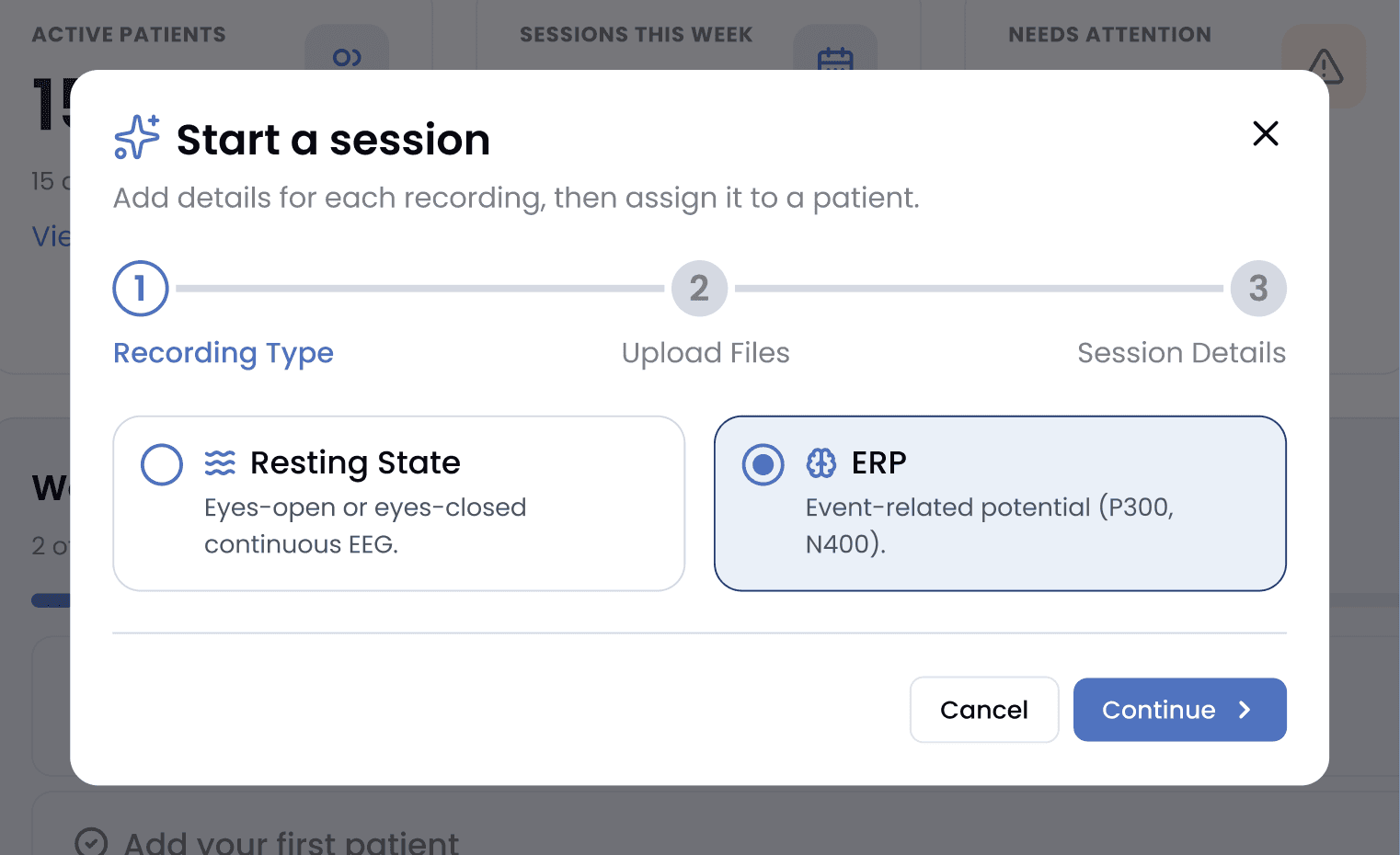
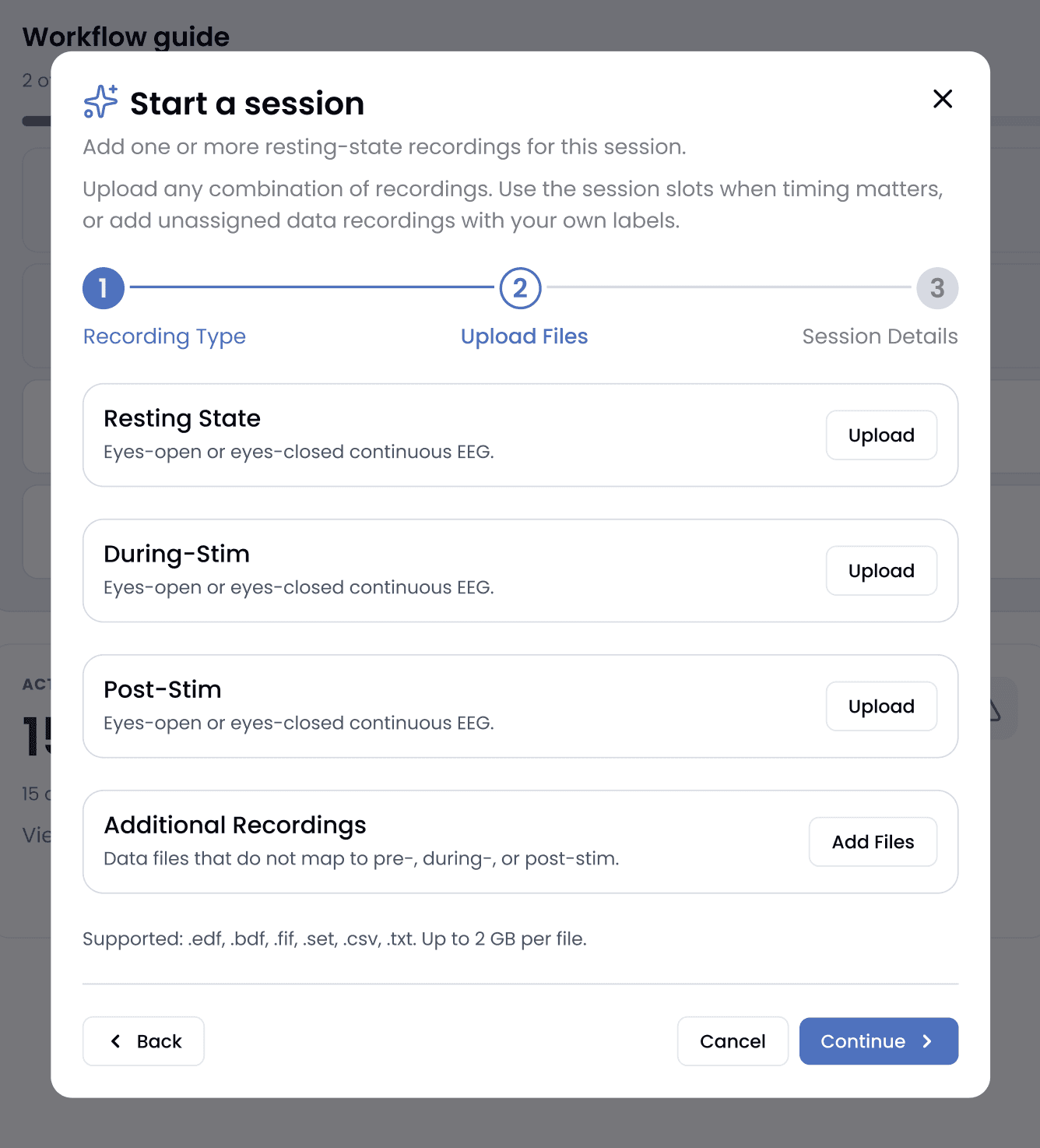
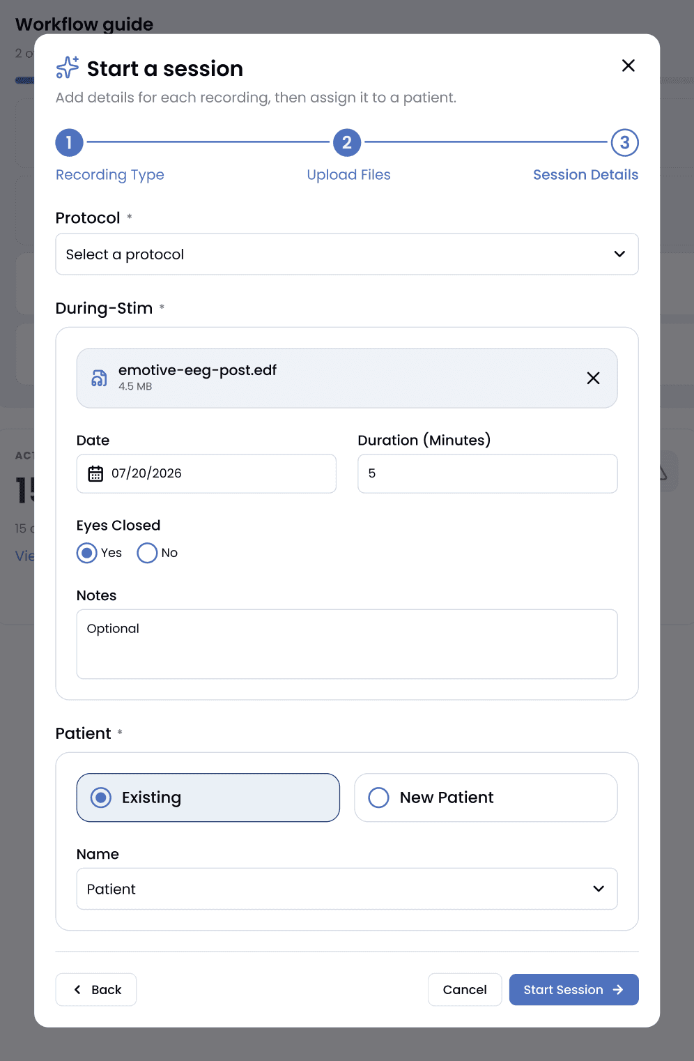
I broke session creation into three focused steps: recording type, file upload, and session details, replacing the single overloaded form flagged in the audit above. A searchable patient dropdown and a progress bar keep the clinician oriented throughout.
I broke session creation into three focused steps: recording type, file upload, and session details, replacing the single overloaded form flagged in the audit above. A searchable patient dropdown and a progress bar keep the clinician oriented throughout.
I broke session creation into three focused steps: recording type, file upload, and session details, replacing the single overloaded form flagged in the audit above. A searchable patient dropdown and a progress bar keep the clinician oriented throughout.
Recording Type
Recording Type
Upload & Labeling
Upload & Labeling
Session Details
Session Details
Patient Management
Patient Management
Patient Management
The patient table supports real filtering and sorting, by protocol, sex, status, and enrollment, with a pop-up filter overlay for the long list of status categories a clinical trial actually uses.
The patient table supports real filtering and sorting, by protocol, sex, status, and enrollment, with a pop-up filter overlay for the long list of status categories a clinical trial actually uses.
The patient table supports real filtering and sorting, by protocol, sex, status, and enrollment, with a pop-up filter overlay for the long list of status categories a clinical trial actually uses.
Furthermore, adding a patient is a single guided form instead of a buried modal:
Furthermore, adding a patient is a single guided form instead of a buried modal:
Furthermore, adding a patient is a single guided form instead of a buried modal:
Post-Upload & Export
Post-Upload & Export
After uploading session data, clinicians land on a processing page with multiple options. Among those options, they can choose to go straight to an export preview page to export the recording data.
After uploading session data, clinicians land on a processing page with multiple options. Among those options, they can choose to go straight to an export preview page to export the recording data.
After uploading session data, clinicians land on a processing page with multiple options. Among those options, they can choose to go straight to an export preview page to export the recording data.

Exporting data matters just as much to clinicians as the analysis itself. The dense results figures used to live directly on the session page. I proposed pulling them out into a dedicated export page instead, with an include/exclude toggle per section and a straight-to-PDF download.
Exporting data matters just as much to clinicians as the analysis itself. The dense results figures used to live directly on the session page. I proposed pulling them out into a dedicated export page instead, with an include/exclude toggle per section and a straight-to-PDF download.
Exporting data matters just as much to clinicians as the analysis itself. The dense results figures used to live directly on the session page. I proposed pulling them out into a dedicated export page instead, with an include/exclude toggle per section and a straight-to-PDF download.

UNIFYING VISUALIZATION
UNIFYING VISUALIZATION
UNIFYING VISUALIZATION
Making Advanced Clinical Tools Feel like One Product.
Making Advanced Clinical Tools Feel like One Product.
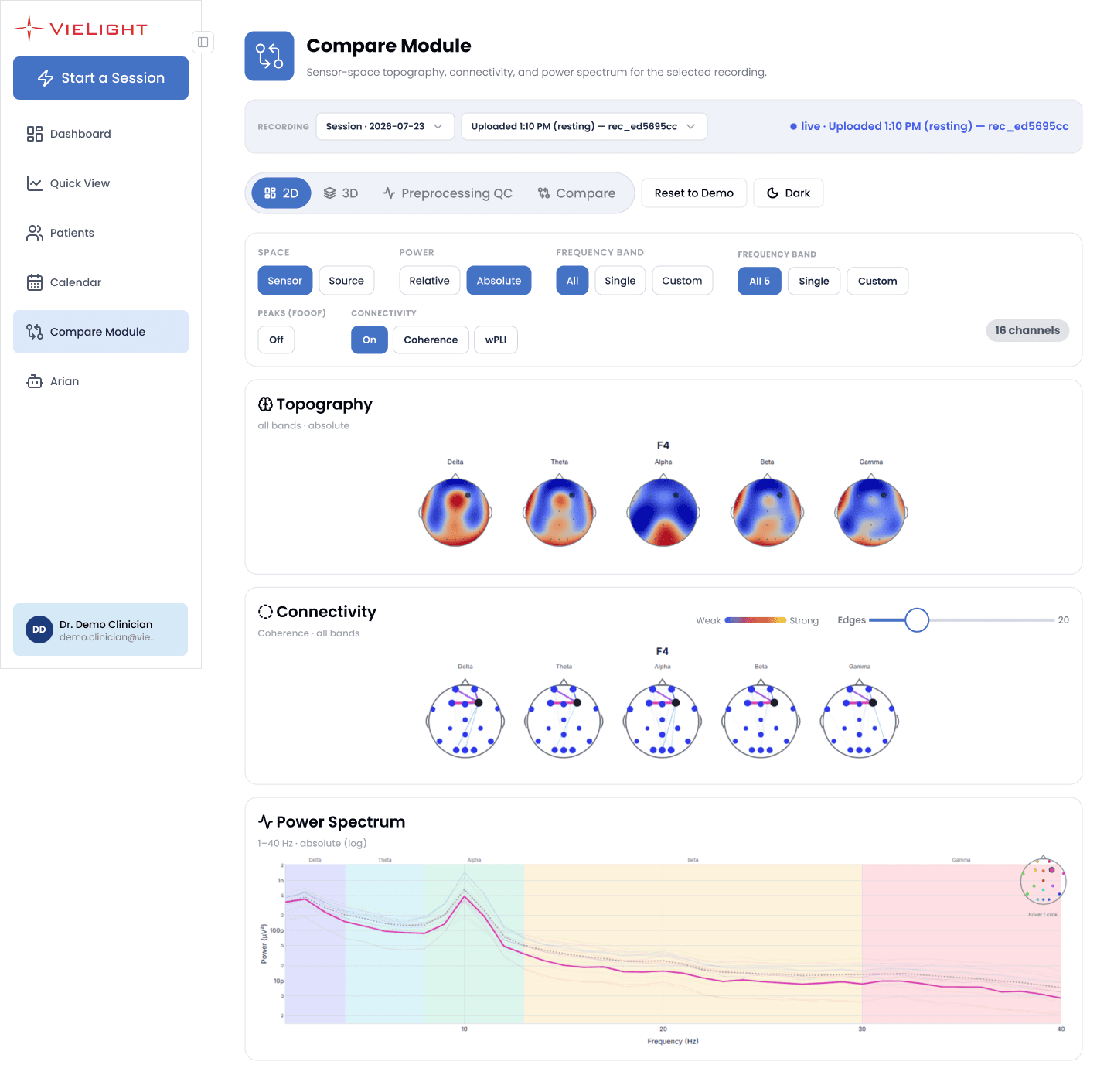
The Compare Module allows clinicians to analyze data more closely and compare multiple data sets. The tools within this module existed as separate tools, each built with its own visual logic. I brought them under a shared toggle bar and a single card language, so switching between them is just a tab click away.
The Compare Module allows clinicians to analyze data more closely and compare multiple data sets. The tools within this module existed as separate tools, each built with its own visual logic. I brought them under a shared toggle bar and a single card language, so switching between them is just a tab click away.
The Compare Module allows clinicians to analyze data more closely and compare multiple data sets. The tools within this module existed as separate tools, each built with its own visual logic. I brought them under a shared toggle bar and a single card language, so switching between them is just a tab click away.
2D View: sensor-space topography, connectivity, and power spectrum, all reading off the same card style
2D View: sensor-space topography, connectivity, and power spectrum, all reading off the same card style
2D View: sensor-space topography, connectivity, and power spectrum, all reading off the same card style
The 3D View keeps the exact same header, recording selector, and mode toggle as 2D. Only the content panel changes, to a source-space brain render with network-level ROI breakdowns.
The 3D View keeps the exact same header, recording selector, and mode toggle as 2D. Only the content panel changes to a source-space brain render with network-level ROI breakdowns.
The 3D View keeps the exact same header, recording selector, and mode toggle as 2D. Only the content panel changes, to a source-space brain render with network-level ROI breakdowns.

Preprocessing QC lives here too, not on the recording flow: raw versus cleaned signal, ICA components removed, and per-channel metrics, in the same card language as the other three tabs.
Preprocessing QC lives here too, not on the recording flow: raw versus cleaned signal, ICA components removed, and per-channel metrics, in the same card language as the other three tabs.
Preprocessing QC lives here too, not on the recording flow: raw versus cleaned signal, ICA components removed, and per-channel metrics, in the same card language as the other three tabs.
Compare Mode reuses the identical topography and power-spectrum cards from the 2D view, just doubled, so a clinician who’s already learned one screen already knows how to read this one.
Compare Mode reuses the identical topography and power-spectrum cards from the 2D view, just doubled, so a clinician who’s already learned one screen already knows how to read this one.
Compare Mode reuses the identical topography and power-spectrum cards from the 2D view, just doubled, so a clinician who’s already learned one screen already knows how to read this one.

LANDING PAGE
LANDING PAGE
LANDING PAGE
Extending the system into the Public-Facing Brand.
Extending the system into the Public-Facing Brand.
Extending the system into the Public-Facing Brand.
After finishing the dashboard, I moved into designing the landing page, the first thing a prospective clinic sees. I storyboarded an animated sequence that changed as the user scrolled down and iterated on terminology and visual accuracy.
After finishing the dashboard, I moved into designing the landing page, the first thing a prospective clinic sees. I storyboarded an animated sequence that changed as the user scrolled down and iterated on terminology and visual accuracy.
Match Tracker (Shown below):
Dedicated page tracking matched profiles.
Notifies users when match threshold is reached, closing feedback loop.
Onboarding (not shown):
Restructured flow to ask for soft preferences and categorize questions.
More logical and sequential flow.
Device Placement
Device Placement
Light Enters the Brain
Light Enters the Brain
EEG Measurement
EEG Measurement
Tracking Over Time
Tracking Over Time
HANDOFF
HANDOFF
HANDOFF
Preparing the Figma File For the Next Designer.
Preparing the Figma File For the Next Designer.
Preparing the Figma File For the Next Designer.
The final stretch of my internship entailed preparing the file so it would make sense to whichever designer picked up the work next. I made the designs into a clickable prototype and wrote a “Notes to Help You” reference page covering every major page in the file: what it’s for, what’s inside it, and how to use it.
The final stretch of my internship entailed preparing the file so it would make sense to whichever designer picked up the work next. I made the designs into a clickable prototype and wrote a “Notes to Help You” reference page covering every major page in the file: what it’s for, what’s inside it, and how to use it.
Match Tracker (Shown below):
Dedicated page tracking matched profiles.
Notifies users when match threshold is reached, closing feedback loop.
Onboarding (not shown):
Restructured flow to ask for soft preferences and categorize questions.
More logical and sequential flow.
Workshop
Current
The main design hub: current design system, every finalized screen, and the one click-through prototype. Use this for stakeholder walkthroughs.
The main design hub: current design system, every finalized screen, and the one click-through prototype. Use this for stakeholder walkthroughs.
The main design hub: current design system, every finalized screen, and the one click-through prototype. Use this for stakeholder walkthroughs.
Landing Page Ideation
Current
Dedicated space for the public marketing site, kept separate from the clinician dashboard. Hero exploration through V3, plus the full assembled page.
Dedicated space for the public marketing site, kept separate from the clinician dashboard. Hero exploration through V3, plus the full assembled page.
Dedicated space for the public marketing site, kept separate from the clinician dashboard. Hero exploration through V3, plus the full assembled page.
Mockups (Not Prototyped)
Supporting
Clean static versions of every shipped screen, same content as Workshop but without the click-through layer. Fastest place to grab an isolated frame.
Clean static versions of every shipped screen, same content as Workshop but without the click-through layer. Fastest place to grab an isolated frame.
Clean static versions of every shipped screen, same content as Workshop but without the click-through layer. Fastest place to grab an isolated frame.
Critical Severity Samples
Archive
The rationale record from the original UX audit: original problem paired with a redesign, frame by frame, for whenever a decision needs justifying.
The rationale record from the original UX audit: original problem paired with a redesign, frame by frame, for whenever a decision needs justifying.
The rationale record from the original UX audit: original problem paired with a redesign, frame by frame, for whenever a decision needs justifying.
Graveyard
Archive
Every earlier iteration and shelved direction, kept for one reason: to explain why we moved away from something, not to build on top of.
Every earlier iteration and shelved direction, kept for one reason: to explain why we moved away from something, not to build on top of.
Every earlier iteration and shelved direction, kept for one reason: to explain why we moved away from something, not to build on top of.
Here’s a closer look at one of those page briefs, for the main design hub:
Here’s a closer look at one of those page briefs, for the main design hub:
Here’s a closer look at one of those page briefs, for the main design hub:
Workshop Page
Workshop Page
Workshop Page
HANDOFF NOTE
HANDOFF NOTE
HANDOFF NOTE
PURPOSE
PURPOSE
The main design hub.
Contains the current design system, every finalized screen, and the one prototype that links everything together.
This is where I did most of my active work.
The main design hub.
Contains the current design system, every finalized screen, and the one prototype that links everything together.
This is where I did most of my active work.
The main design hub.
Contains the current design system, every finalized screen, and the one prototype that links everything together.
This is where I did most of my active work.
WHAT'S INSIDE
WHAT'S INSIDE
Design system row (top): Typography, Buttons, Icons, Colors, Side Menu, Tags, Menu, Dropdown, and other core components/tokens (as styles, not variables).
Prototyped screens: Recordings, Patients, Dashboard, Calendar, Compare Module (4 switchable analysis modes), Session / Start a Session wizard.
This is the one to use for stakeholder walkthroughs or demos.
Design system row (top): Typography, Buttons, Icons, Colors, Side Menu, Tags, Menu, Dropdown, and other core components/tokens (as styles, not variables).
Prototyped screens: Recordings, Patients, Dashboard, Calendar, Compare Module (4 switchable analysis modes), Session / Start a Session wizard.
This is the one to use for stakeholder walkthroughs or demos.
Design system row (top): Typography, Buttons, Icons, Colors, Side Menu, Tags, Menu, Dropdown, and other core components/tokens (as styles, not variables).
Prototyped screens: Recordings, Patients, Dashboard, Calendar, Compare Module (4 switchable analysis modes), Session / Start a Session wizard.
This is the one to use for stakeholder walkthroughs or demos.
IMPORTANT NOTE
IMPORTANT NOTE
Because this page holds both loose ideation frames and the “real” finalized versions, double check you’re grabbing the frame that’s wired into the bottom prototype row before treating any single frame as canonical.
A couple of pages have multiple similarly-named variants sitting side by side.
Because this page holds both loose ideation frames and the “real” finalized versions, double check you’re grabbing the frame that’s wired into the bottom prototype row before treating any single frame as canonical.
A couple of pages have multiple similarly-named variants sitting side by side.
Because this page holds both loose ideation frames and the “real” finalized versions, double check you’re grabbing the frame that’s wired into the bottom prototype row before treating any single frame as canonical.
A couple of pages have multiple similarly-named variants sitting side by side.
LESSONS & TAKEAWAYS
LESSONS & TAKEAWAYS
LESSONS & TAKEAWAYS
My Designs Were the Primary Direction for the First Release.
My Designs Were the Primary Direction for the First Release.
My Designs Were the Primary Direction for the First Release.
The prototype was demoed at ISNR Las Vegas 2026, where it was received positively. Afterwards, my design was chosen as the primary direction for Vielight’s first clinician-facing product release. The core experience is moving into engineering as designed, with Beta testing planned for October 2026.
The prototype was demoed at ISNR Las Vegas 2026, where it was received positively. Afterwards, my design was chosen as the primary direction for Vielight’s first clinician-facing product release. The core experience is moving into engineering as designed, with Beta testing planned for October 2026.
The prototype was demoed at ISNR Las Vegas 2026, where it was received positively. Afterwards, my design was chosen as the primary direction for Vielight’s first clinician-facing product release. The core experience is moving into engineering as designed, with Beta testing planned for October 2026.
A few things this sharpened along the way:
A few things this sharpened along the way:
A few things this sharpened along the way:
🏛️
Design Systems are a Product's Infrastructure
Design Systems are a Product's Infrastructure
Design Systems are a Product's Infrastructure
A shared component and token system let engineering build directly from Figma and made the entire platform feel unified. That structure is what actually shipped, not just a nicer-looking screen.
A shared component and token system let engineering build directly from Figma and made the entire platform feel unified. That structure is what actually shipped, not just a nicer-looking screen.
A shared component and token system let engineering build directly from Figma and made the entire platform feel unified. That structure is what actually shipped, not just a nicer-looking screen.
🔍
An Audit is a Stronger Lever Than an Opinion.
An Audit is a Stronger Lever Than an Opinion.
An Audit is a Stronger Lever Than an Opinion.
Forty-five issues, each tied to a specific screen and ranked by severity, moved the pre-launch roadmap in a way that a vague “this feels cluttered” never could have. Being systematic about the problem was as valuable as any individual screen I designed.
Forty-five issues, each tied to a specific screen and ranked by severity, moved the pre-launch roadmap in a way that a vague “this feels cluttered” never could have. Being systematic about the problem was as valuable as any individual screen I designed.
Forty-five issues, each tied to a specific screen and ranked by severity, moved the pre-launch roadmap in a way that a vague “this feels cluttered” never could have. Being systematic about the problem was as valuable as any individual screen I designed.
💬
Communicating Design Rationale Builds Team Trust.
Communicating Design Rationale Builds Team Trust.
Communicating Design Rationale Builds Team Trust.
When I explained not just what I designed but why, the team could align faster and move into implementation with confidence. Clear organization turned out to be its own form of impact.
When I explained not just what I designed but why, the team could align faster and move into implementation with confidence. Clear organization turned out to be its own form of impact.
When I explained not just what I designed but why, the team could align faster and move into implementation with confidence. Clear organization turned out to be its own form of impact.
FEEDBACK
FEEDBACK
FEEDBACK
Some Kind Words from Teammates.
Some Kind Words from Teammates.
Some Kind Words from Teammates.
“Working with David was a very positive experience. He contributed meaningfully across the UX audit, Figma design system, clinician dashboard, and patient/session flows. What stood out most was his ability to clearly communicate his thought process behind design decisions, making it easy to understand not only what he designed, but why. He was thoughtful, organized, receptive to feedback, and helped bring much more clarity and structure to the platform experience.”
“Working with David was a very positive experience. He contributed meaningfully across the UX audit, Figma design system, clinician dashboard, and patient/session flows. What stood out most was his ability to clearly communicate his thought process behind design decisions, making it easy to understand not only what he designed, but why. He was thoughtful, organized, receptive to feedback, and helped bring much more clarity and structure to the platform experience.”
“Working with David was a very positive experience. He contributed meaningfully across the UX audit, Figma design system, clinician dashboard, and patient/session flows. What stood out most was his ability to clearly communicate his thought process behind design decisions, making it easy to understand not only what he designed, but why. He was thoughtful, organized, receptive to feedback, and helped bring much more clarity and structure to the platform experience.”
“Working with David was a very positive experience. He contributed meaningfully across the UX audit, Figma design system, clinician dashboard, and patient/session flows. What stood out most was his ability to clearly communicate his thought process behind design decisions, making it easy to understand not only what he designed, but why. He was thoughtful, organized, receptive to feedback, and helped bring much more clarity and structure to the platform experience.”
AI Team Lead, Vielight
AI Team Lead, Vielight
AI Team Lead, Vielight
“David was a pleasure to work with, especially from the engineering side. He took real ownership across the UX audit, the clinician dashboard, and the patient and session flows, and the EEG report designs in particular asked a lot of him. He had to sit with dense, unfamiliar neuro data and keep asking questions until he understood what clinicians actually needed to see. What stood out most was his thoroughness. He never stopped at a first draft, he chased down the edge cases the rest of us hadn’t thought about, kept the design system clean and organized, and handed over work that engineering could build from directly. He raised the quality bar of the whole platform experience.”
“David was a pleasure to work with, especially from the engineering side. He took real ownership across the UX audit, the clinician dashboard, and the patient and session flows, and the EEG report designs in particular asked a lot of him. He had to sit with dense, unfamiliar neuro data and keep asking questions until he understood what clinicians actually needed to see. What stood out most was his thoroughness. He never stopped at a first draft, he chased down the edge cases the rest of us hadn’t thought about, kept the design system clean and organized, and handed over work that engineering could build from directly. He raised the quality bar of the whole platform experience.”
“David was a pleasure to work with, especially from the engineering side. He took real ownership across the UX audit, the clinician dashboard, and the patient and session flows, and the EEG report designs in particular asked a lot of him. He had to sit with dense, unfamiliar neuro data and keep asking questions until he understood what clinicians actually needed to see. What stood out most was his thoroughness. He never stopped at a first draft, he chased down the edge cases the rest of us hadn’t thought about, kept the design system clean and organized, and handed over work that engineering could build from directly. He raised the quality bar of the whole platform experience.”
AI Engineer, Vielight
AI Engineer, Vielight
AI Engineer, Vielight


Thanks For Stopping By
© David Jin 2026