
Seal Dating
Seal Dating
Seal Dating
Redesigning a Community-Powered Dating App
Redesigning a Community-Powered Dating App
Redesigning a Community-Powered Dating App

TIMELINE
TIMELINE
TIMELINE
July 2025 – November 2025
July 2025 – November 2025
July 2025 – November 2025
ROLE
ROLE
Sole UI/UX Designer
3 Software Engineers
2 Product Owners
2 Business Managers
Me as the sole UX Designer
Sole UX Designer
SKILLS
SKILLS
SKILLS
UX Design, Prototyping, User Research
UX Design, Prototyping, User Research
OVERVIEW
OVERVIEW
OVERVIEW
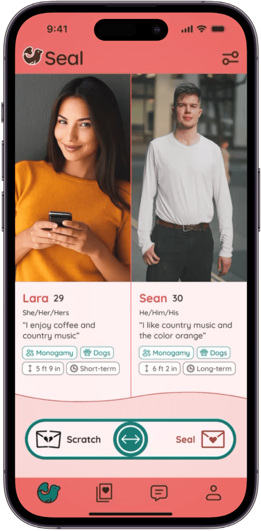
Seal is a startup dating app where users act as matchmakers for others.
Seal is a startup dating app where users act as matchmakers for others.
Seal is a startup dating app where users act as matchmakers for others.
Incubated in the Fulcrum GT Startup Lab, I joined Seal after 1 previous year of development.
My work included:
Incubated in the Fulcrum GT Startup Lab, I joined Seal after 1 previous year of development.
My work included:
Seal is a social matchmaking app where users act as matchmakers for others. Incubated in the Fulcrum GT Startup Lab, I joined Seal after 1 previous year of development.
1
Core Feature Redesign
🏗️
Restructured the matchmaker screen with improved text hierarchy and navigation.
2
End-to-End Ownership
⚡️
Conducted all relevant UX Research & Design work.
Conducted all relevant UX Research & Design work as the sole designer.
3
Data-Backed Visual Pivots
🎨
Validated final UI choices through continuous user feedback.
4
Influencing Existing Culture
💡
Embedded a data-informed culture by presenting objective research findings.
PROBLEM SPACE
PROBLEM SPACE
PROBLEM SPACE
All existing design decisions were only based on internal approval.
All existing design decisions were only based on internal approval.
All existing design decisions were only based on internal approval.
Since Seal didn't have a dedicated UX role in the past, every design and feature decision was never validated with target users.
I was in a strategic dilemma.
Since the team had already invested significant time into the existing product, I believed my best course of action was to improve what existed while planting seeds for a more user-centered approach.
Since Seal didn't have a dedicated UX role in the past, every design and feature decision was never validated with target users.
I was in a strategic dilemma.
Since the team had already invested significant time into the existing product, I believed my best course of action was to improve what existed while planting seeds for a more user-centered approach.
Since Seal didn't have a dedicated UX role in the past, every design and feature decision was never validated with target users.
I was in a strategic dilemma.
Since the team had already invested significant time into the existing product, I believed my best course of action was to improve what existed while planting seeds for a more user-centered approach.
Since Seal didn't have a dedicated UX role in the past, every design and feature decision was never validated with target users.
I was in a strategic dilemma.
Since the team had already invested significant time into the existing product, I believed my best course of action was to improve what existed while planting seeds for a more user-centered approach.
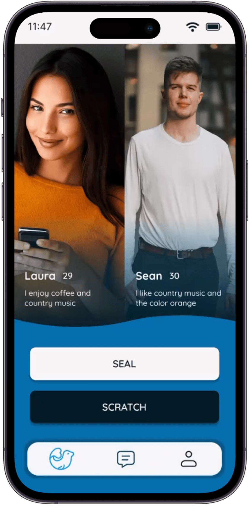
Original Homepage Layout
Original Homepage Layout
Current issues in the app that I had to address included:
Current issues in the app that I had to address included:
Current issues in the app that I had to address included:


COLOR REBRAND
COLOR REBRAND
COLOR REBRAND
Auditing and Correcting a Failed Color Scheme
Auditing and Correcting a Failed Color Scheme
Auditing and Correcting a Failed Color Scheme
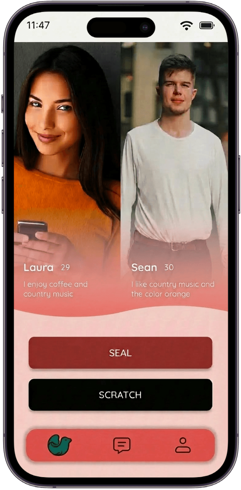
Before I joined, the app had a blue color scheme. To validate these colors, I ran a guerrilla usability test, showing the current branding alongside 2 color variants (Purple and Red), asking users what the colors evoked and whether they fit a dating app.
User feedback was immediate and consistent
Users felt a strong brand mismatch between the initial colors and the context of dating.
The straightforward answer was the best answer.
Before I joined, the app had a blue color scheme. To validate these colors, I ran a guerrilla usability test, showing the current branding alongside 2 color variants (Purple and Red), asking users what the colors evoked and whether they fit a dating app.
User feedback was immediate and consistent
Users felt a strong brand mismatch between the initial colors and the context of dating.
The straightforward answer was the best answer.
Before I joined, the team had already rolled out a blue-and-orange color scheme, assuming blue was a safe, “gender-neutral” choice.
To validate this direction, I ran a quick guerrilla usability test, showing the current branding alongside 2 color variants developed by myself, and asking users what the colors evoked and whether they fit a dating app.
Justification for Choosing Color Variants:
Purple was tested because it is a unique color in the dating app space, and would help us establish a unique brand identity within the current market.
Red was tested because it's a color commonly associated with love, and would be a very straightforward color scheme that wouldn't confuse anyone.
🎨
Justification for Color Variants
Justification for Color Variants
🔵
Why Blue?
Why Blue?
Why Blue?
Blue was originally assumed to be an inclusive, "gender-neutral" color.
The team picked blue because they assumed it was inclusive and "gender-neutral".
Blue was originally assumed to be an inclusive, "gender-neutral" color.
Blue was originally assumed to be an inclusive, "gender-neutral" color.
🔮
Why Purple?
Why Purple?
Why Purple?
Purple was a unique color that would establish a distinct brand in the current market.
A unique color that could establish a distinct brand in the current market.
Purple was a unique color that would establish a distinct brand in the current market.
Purple was a unique color that would establish a distinct brand in the current market.
❤️
Why Red?
Why Red?
Why Red?
Red was a very straightforward color commonly associated with love and romance.
Red was a straightforward color associated with love and romance.
Red was a very straightforward color commonly associated with love and romance.
Red was a very straightforward color commonly associated with love and romance.
Blue (Original Colors)
Blue
(Original Colors)
Blue (Original Colors)
Blue (Original Colors)
Purple (Color Variant 1 )
Purple
(Color Variant 1)
Purple (Color Variant 1 )
Purple (Color Variant 1 )

Red (Color Variant 2)
Red
(Color Variant 2)
Red (Color Variant 2)
Color Variant 2
💬
User Feedback

Blue
Blue
Blue
Read as "banking", "finance", and "corporate", the opposite of romantic.
Read as "banking", "finance", and "corporate", the opposite of romantic.
Read as "banking", "finance", and "corporate", the opposite of romantic.

Purple
Purple
Purple
While unique, it gives off a mystical, tarot-card vibe that doesn't fit for a dating app.
While unique, it gives off a mystical, tarot-card vibe that doesn't fit for a dating app.
While unique, it gives off a mystical, tarot-card vibe that doesn't fit for a dating app.
❤️
Red
Red
Red
Red read as having passion and warmth. Users said it "finally feels like a dating app".
Red read as having passion and warmth. Users said it "finally feels like a dating app".
Red read as having passion and warmth. Users said it "finally feels like a dating app".
Impact
Red became our new primary color, with teal added as a complementary color to provide modern contrast and balance.
This situation proved the value of user-centered design decisions early in the process and set a precedent that all major changes in the future would be tested with target users.
Impact
Red became our new primary color, with teal added as a complementary color to provide modern contrast and balance.
This situation proved the value of user-centered design decisions early in the process and set a precedent that all major changes in the future would be tested with target users.
Impact
Red became our new primary color, with teal added as a complementary color to provide modern contrast and balance.
This situation proved the value of user-centered design decisions early in the process and set a precedent that all major changes in the future would be tested with target users.
DESIGN SYSTEM
DESIGN SYSTEM
DESIGN SYSTEM
Establishing a Unified Visual Language
Establishing a Unified Visual Language
Establishing a Unified Visual Language
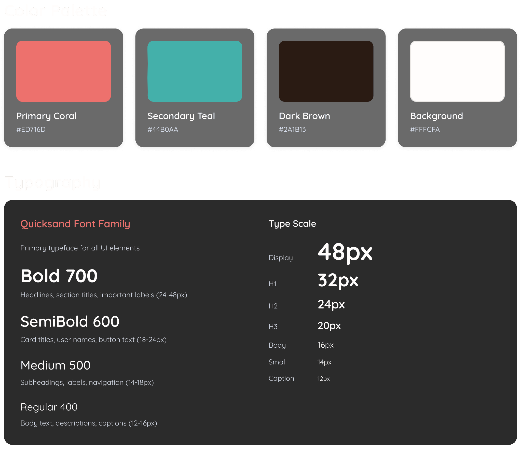
After finalizing colors, the next thing I did was building a comprehensive design system.
By standardizing typography and interactive elements, I ensured that developers didn't have to relearn the interface on every screen when implementing.
I believed in testing the solution relentlessly. I designed and facilitated formal usability tests with over 15 participants, presenting two competing homepage layouts (AB Testing) built in the new color scheme.
Since Seal lacked a unified visual language, there were various UI inconsistencies across the platform.
After finalizing colors, the next thing I did was building a comprehensive design system.
By standardizing typography (Quicksand) and interactive elements, I ensured that developers didn't have to "re-learn" the interface on every screen when implementing.

Impact
40% Increase in Handoff Efficiency: Provided developers with documented components and global styles, significantly reducing the QA feedback loop.
Design Integrity: The system ensured that the brand identity remained 100% consistent.
Future-Proofing: The modular nature of the system allows the Seal team to roll out new features in days rather than weeks by reconfiguring existing organisms.
Impact
40% Increase in Handoff Efficiency: Provided developers with documented components and global styles, significantly reducing the QA feedback loop.
Design Integrity: The system ensured that the brand identity remained 100% consistent.
Future-Proofing: The modular nature of the system allows the Seal team to roll out new features in days rather than weeks by reconfiguring existing organisms.
Impact
40% Increase in Handoff Efficiency: Provided developers with documented components and global styles, significantly reducing the QA feedback loop.
Design Integrity: The system ensured that the brand identity remained 100% consistent.
Future-Proofing: The modular nature of the system allows the Seal team to roll out new features in days rather than weeks by reconfiguring existing organisms.
MULTIVARIATE TESTING
MULTIVARIATE TESTING
MULTIVARIATE TESTING
Exploring Two Navigation Options
Exploring Two Navigation Options
Exploring Two Navigation Options
After fixing the colors and iterating some more, I had to address the tedious navigation and confusing layout of the existing site, I conducted a multivariate usability test with 16 participants, comparing two competing homepage layouts built in the new color palette.
To address the tedious navigation and confusing layout of the existing site, I conducted a multivariate usability test with 16 participants, comparing two competing homepage layouts.
After fixing the colors and iterating some more, I had to address the tedious navigation and confusing layout of the existing site, I conducted a multivariate usability test with 16 participants, comparing two competing homepage layouts built in the new color palette.
After fixing the colors and iterating some more, I had to address the tedious navigation and confusing layout of the existing site, I conducted a multivariate usability test with 16 participants, comparing two competing homepage layouts built in the new color palette.
Layout A: Individual Profile Pages
Layout A: Individual Profile Pages
Layout A:
Individual Profile Pages
The Original Design:
Tap a person's photo on the homepage to open their individual profile.
Matches the layout of other existing apps.
The Original Design:
Tap a person's photo on the homepage to open their individual profile.
Matches the layout of other existing apps.
The Original Design:
Tap a person's photo on the homepage to open their individual profile.
Matches the layout of other existing apps.
Layout B: Horizontal Scrolling
Layout B: Horizontal Scrolling
Layout B:
Horizontal Scrolling
An Experimental Idea:
Swipe horizontally to the right to view all user info on a single screen.
Hypothesis was that it would reduce navigation fatigue.
An Experimental Idea:
Swipe horizontally to the right to view all user info on a single screen.
Hypothesis was that it would reduce navigation fatigue.
An Experimental Idea:
Swipe horizontally to the right to view all user info on a single screen.
Hypothesis was that it would reduce navigation fatigue.
Key Findings
75% of users preferred Layout A
75% of users preferred Layout A
75% of users preferred Layout A
12/16 users claimed tapping felt intuitive and aligned with their existing mental models of how profile browsing should work.
12/16 users claimed tapping felt intuitive and aligned with their existing mental models of how profile browsing should work.
12/16 users claimed tapping felt intuitive and aligned with their existing mental models of how profile browsing should work.
Horizontal Scrolling Rejected
Horizontal Scrolling Rejected
Horizontal Scrolling Rejected
Horizontal scrolling was "not intuitive at all" and was compared to "looking at a camera gallery… I detest it."
Horizontal scrolling was "not intuitive at all" and was compared to "looking at a camera gallery… I detest it."
Horizontal scrolling was "not intuitive at all" and was compared to "looking at a camera gallery… I detest it."
Unexpected Insight: Language Matters
Unexpected Insight: Language Matters
Unexpected Insight: Language Matters
During testing, participants flagged the tagline "Let's Seal the Deal" as reinforcing negative masculine stereotypes. As a result, the slogan was changed to "Break the Ice," making the language more inclusive.
During testing, participants flagged the tagline "Let's Seal the Deal" as reinforcing negative masculine stereotypes. As a result, the slogan was changed to "Break the Ice," making the language more inclusive.
During testing, participants flagged the tagline "Let's Seal the Deal" as reinforcing negative masculine stereotypes. As a result, the slogan was changed to "Break the Ice," making the language more inclusive.
Side-by-Side Comparison Value
Side-by-Side Comparison Value
Side-by-Side Comparison Value
Despite the rejection of Layout B, many users still said they liked the concept of comparing key attributes side-by-side without constant screen switching.
Despite the rejection of Layout B, many users still said they liked the concept of comparing key attributes side-by-side without constant screen switching.
Despite the rejection of Layout B, many users still said they liked the concept of comparing key attributes side-by-side without constant screen switching.
Impact
The A/B test demonstrated the value of testing even seemingly small interaction models, and proved that a dedicated UX research function can uncover critical perception issues beyond usability.
Despite the rejection of Layout B, the concept of comparing key attributes side-by-side directly influenced the final design.
Impact
The A/B test demonstrated the value of testing even seemingly small interaction models, and proved that a dedicated UX research function can uncover critical perception issues beyond usability.
Despite the rejection of Layout B, the concept of comparing key attributes side-by-side directly influenced the final design.
Impact
The A/B test demonstrated the value of testing even seemingly small interaction models, and proved that a dedicated UX research function can uncover critical perception issues beyond usability.
Despite the rejection of Layout B, the concept of comparing key attributes side-by-side directly influenced the final design.
CORE REDESIGN
CORE REDESIGN
CORE REDESIGN
I focused on three major friction points that surfaced repeatedly in user feedback.
I focused on three major friction points that surfaced repeatedly in user feedback.
My motivation for redesigning the core experience centered around making the main actions feel easy and enjoyable. I focused on three major friction points that surfaced repeatedly in user feedback.
Standardized Visual Hierarchy
Standardized Visual Hierarchy
I Implemented new rules for imagery, spacing, and typography to eliminate inconsistencies and create an organized layout.
I Implemented new rules for imagery, spacing, and typography to eliminate inconsistencies and create an organized layout.
I Implemented new rules for imagery, spacing, and typography to eliminate inconsistencies and create an organized layout.
Before
Before
Before

After (Current Redesign)
After (Current Redesign)
After

Key Improvements
Key Improvements
More Front Page Information
More Front Page Information
More Front Page Information
Provided more information on the front page, giving users the option to scan key traits quickly without having to navigate deeper.
Provided more information on the front page, giving users the option to scan key traits quickly without having to navigate deeper.
Provided more information on the front page, giving users the option to scan key traits quickly without having to navigate deeper.
Color-Coded Information Tags
Color-Coded Information Tags
Color-Coded Information Tags
Implemented a colored tag system to help users scan for key traits instantly:
Implemented a colored tag system to help users scan for key traits instantly:
Implemented a colored tag system to help users scan for key traits instantly:
Green for commonalities
Green for commonalities
Green for commonalities
Gray for neutral/opposite traits
Gray for neutral/opposite traits
Gray for neutral traits
Standardized Image Ratio
Standardized Image Ratio
Standardized Image Ratio
Set all images to a consistent 9:16 ratio, since there wasn't any image standardization beforehand.
Set all images to a consistent 9:16 ratio, since there wasn't any image standardization beforehand.
Set all images to a consistent 9:16 ratio, since there wasn't any image standardization beforehand.
Impact
Users can now make voting decisions faster and easier by quickly scanning the organized, color-coded information at a glance.
Impact
Users can now make voting decisions faster and easier by quickly scanning the organized, color-coded information at a glance.
Impact
Users can now make voting decisions faster and easier by quickly scanning the organized, color-coded information at a glance.
Gamifying the Core Matchmaking Experience
Gamifying the Core Matchmaking Experience
As a matchmaker, users originally pressed buttons for “Seal” (voting yes to a couple) and “Scratch” (voting no). The transition after voting was a standard wave animation that dropped down for Seal, and slid up for Scratch
As a matchmaker, users originally pressed buttons for “Seal” (voting yes to a couple) and “Scratch” (voting no). The transition after voting was a standard wave animation that dropped down for Seal, and slid up for Scratch
As a matchmaker, users originally pressed buttons for “Seal” (voting yes to a couple) and “Scratch” (voting no). The transition after voting was a standard wave animation that dropped down for Seal, and slid up for Scratch
User Feedback from Testing
User Feedback from Testing
User Feedback from Testing
“This feels like purchasing something, not a dating app.”
“This feels like purchasing something, not a dating app.”
“This feels like purchasing something, not a dating app.”
“It’s functional, but very generic.”
“It’s functional, but very generic.”
“It’s functional, but very generic.”
“I don't feel excited to continue using this.”
“I don't feel excited to continue using this.”
“I don't feel excited to continue using this.”
Idea from Feedback:
Users referenced Tinder’s swipe mechanic for more engaging decision-making in a dating app setting.
However, that exact mechanism wouldn't make our product unique.
Idea from Feedback:
Users referenced Tinder’s swipe mechanic for more engaging decision-making in a dating app setting.
However, that exact mechanism wouldn't make our product unique.
A More Engaging Solution: Gamified Slider
Redesign: Directional Slider & Wave Animations
Redesign: Directional Slider & Wave Animations
The design solution I created was replacing the buttons with a draggable slider, along with redesigning the transition animation.
The design solution I created was replacing the buttons with a draggable slider, along with redesigning the transition animation.
Slider Interaction: Users drag a “puck” to vote "Seal" or "Scratch" on a couple.
Slider Interaction: Users drag a “puck” to vote "Seal" or "Scratch" on a couple.
Slider Interaction: Users drag a “puck” to vote "Seal" or "Scratch" on a couple.
Wave: The waves for "Seal" and "Scratch" now match the colors and direction of the slider
Wave: The waves for "Seal" and "Scratch" now match the colors and direction of the slider
Wave: The waves for "Seal" and "Scratch" now match the colors and direction of the slider
Directional Bias: I was worried the placement of profiles (left vs. right) could subconsciously sway votes. I mitigated this by randomizing the left/right placement of profiles that matchmakers see.
Directional Bias: I was worried the placement of profiles (left vs. right) could subconsciously sway votes. I mitigated this by randomizing the left/right placement of profiles that matchmakers see.
Directional Bias: I was worried the placement of profiles (left vs. right) could subconsciously sway votes. I mitigated this by randomizing the left/right placement of profiles that matchmakers see.
Impact
83% user preference (10 out of 12 users) for the slider over the buttons.
New layout described as “significantly more enjoyable” and “using it feels less like work.”
Impact
83% user preference (10 out of 12 users) for the slider over the buttons.
New layout described as “significantly more enjoyable” and “using it feels less like work.”
Impact
83% user preference (10 out of 12 users) for the slider over the buttons.
New layout described as “significantly more enjoyable” and “using it feels less like work.”
Comparative Profile Analysis
Comparative Profile Analysis
Comparative Profile Analysis
Initial Design:
Users tapped through the photo slideshow to see user pictures.
Basic info (e.g., height, gender) is hidden behind a "?" icon.
No other available user information for the matchmaker to see.
Initial Design:
Tap through photo slideshow to see user pictures.
Basic info (e.g., height, gender) hidden behind a "?" icon.
User Pain Points
User Pain Points
User Pain Points
"I want to know if they both are looking for long-term relationships without clicking five different times."
"I want to know if they both are looking for long-term relationships without clicking five different times."
"I want to know if they both are looking for long-term relationships without clicking five different times."
"I don't see nearly enough information to know what they're really like as people"
"I don't see nearly enough information to know what they're really like as people"
Original Profile Layout
Original Profile Flow
Original Profile Layout
Original Profile Layout

Original Homepage
User taps Sean's picture to learn more about him.
Original Homepage
User taps Sean's picture to learn more about him.
Original Homepage
User taps Sean's picture to learn more about him.

Individual Profile
User taps the '?' icon to reveal Sean's basic traits.
Individual Profile
User taps the '?' icon to reveal Sean's basic traits.
Individual Profile
User taps the '?' icon to reveal Sean's basic traits.

Basic Traits Overlay
User views traits and taps the right side to view more pictures.
Basic Traits Overlay
User views traits and taps the right side to view more pictures.
Basic Traits Overlay
User views traits and taps the right side to view more pictures.

Laura's Profile
User repeats the same flow they did for Sean. They make a Seal/Scratch decision whenever they want.
Laura's Profile
User repeats the same flow they just did for Sean. They decide to Seal/Scratch when they're ready.
Laura's Profile
User repeats the same flow they did for Sean. They make a Seal/Scratch decision whenever they want.

Homepage Return
Now, user must tap Laura's photo to view her details.
Homepage Return
Now, user must tap Laura's photo to view her details.
Homepage Return
Now, user must tap Laura's photo to view her details.

Individual Profile (Cont.)
User continues tapping to view more photos. To viewLaura's traits, they tap the back arrow.
Individual Profile (Pages 2-4)
User continues tapping to view more photos. To view Laura's traits, they tap the back arrow.
Individual Profile (Cont.)
User continues tapping to view more photos. To viewLaura's traits, they tap the back arrow.
Navigation Problem
Navigation Problem
Navigation Problem
Comparing traits required navigating repeatedly between 3 screens:
Comparing traits required navigating repeatedly between 3 screens:
Comparing traits required navigating repeatedly between 3 screens:
Homepage
Homepage
User A's Profile
User A's Profile
User B's Profile
User B's Profile
Redesign: Making Profile Comparison Easier
Redesign: Making Profile Comparison Easier
Redesign: Making Profile Comparison Easier
Information Architecture
Information Architecture
Information Architecture
Grouped data into clear categories
Bio, Dating Preferences, Basic Info, Soft Preferences (Personality).
Grouped data into clear categories
Bio, Dating Preferences, Basic Info, Soft Preferences (Personality).
Grouped data into clear categories
Bio, Dating Preferences, Basic Info, Soft Preferences (Personality).
Noteworthy Features
Noteworthy Features
Noteworthy Features
Added a direct “Compare” button.
Added a shortcut to switch to the other user profile without going to the homepage.
Similar to homepage, matching traits turn green to visually display compatibility.
Added a direct “Compare” button.
Added a shortcut to switch to the other user profile without going to the homepage.
Similar to homepage, matching traits turn green to visually display compatibility.
Added a direct “Compare” button.
Added a shortcut to switch to the other user profile without going to the homepage.
Similar to homepage, matching traits turn green to visually display compatibility.
Revised Profile Layout
Revised Profile Layout
Revised Profile Layout

Redesigned Homepage
Like the Original, user taps Sean's picture to learn more about him.
Redesigned Homepage
Like the Original, user taps Sean's picture to learn more about him.
Redesigned Homepage
Like the Original, user taps Sean's picture to learn more about him.

Individual Profile
User swipes right on the photo carousel to view more.
Individual Profile
User swipes right on the photo carousel to view more.
Individual Profile
User swipes right on the photo carousel to view more.
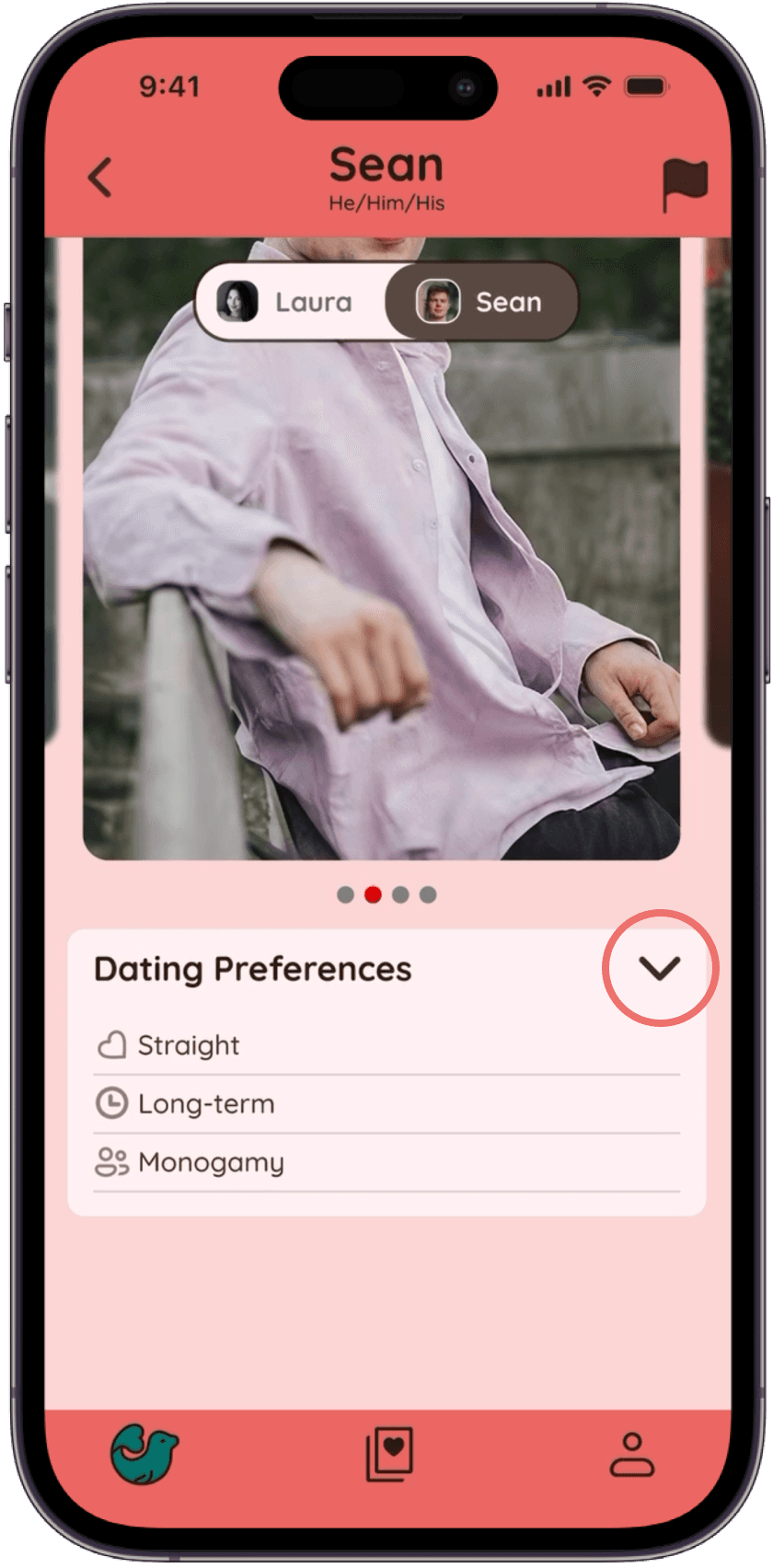
Information Sections
User scrolls down from pictures view sections. User can tap the arrow icon to compare traits.
Information Sections
User scrolls down from pictures view sections. User can tap the arrow icon to compare traits.
Information Sections
User scrolls down from pictures view sections. User can tap the arrow icon to compare traits.

Laura's Profile
User can view Laura's profile without any tedious back-and-forth homepage navigation.
Laura's Profile
User can view Laura's profile without any tedious back-and-forth homepage navigation.
Laura's Profile
User can view Laura's profile without any tedious back-and-forth homepage navigation.

Individual Profile (Cont.)
Further exploration reveals more about Sean. User taps the "Laura" button on the toggle menu to switch profiles.
Individual Profile (Page 4)
More exploring reveals more about Sean (ex. Soft Preferences). User uses the toggle menu to switch profiles.
Individual Profile (Cont.)
Further exploration reveals more about Sean. User taps the "Laura" button on the toggle menu to switch profiles.

Comparison Shortcut
User compares traits for both profiles. User keeps swiping right on carousel to see more information.
Comparison Shortcut
User compares traits for both profiles. User keeps swiping right on carousel to see more information.
Comparison Shortcut
User compares traits for both profiles. User keeps swiping right on carousel to see more information.
Impact:
Users no longer have to navigate back and forth between pages to view all available information.
Impact:
Users no longer have to navigate back and forth between pages to view all available information.
ADDITIONAL CHANGES
ADDITIONAL CHANGES
ADDITIONAL CHANGES
Match Tracker Page
Match Tracker Page
Match Tracker Page
A dedicated page that logs every couple a user has voted on.
Shows how the community is voting, and whether a user's matchmaking judgment aligns with other users.
The tracker notifies users when "match threshold" is reached, closing feedback loop.
A dedicated page that logs every couple a user has voted on.
Shows how the community is voting, and whether a user's matchmaking judgment aligns with other users.
The tracker notifies users when "match threshold" is reached, closing feedback loop.
Match Tracker (Shown below):
Dedicated page tracking matched profiles.
Notifies users when match threshold is reached, closing feedback loop.
Onboarding (not shown):
Restructured flow to ask for soft preferences and categorize questions.
More logical and sequential flow.

LESSONS & TAKEAWAYS
LESSONS & TAKEAWAYS
LESSONS & TAKEAWAYS
What I’ll Carry Forward
User Advocacy Through Data
83% of users prefer the slider feature over the static buttons,
75% choose a familiar tap‑to‑profile layout over horizontal scrolling.
Pragmatism & Impact
Real‑world constraints can still yield measurable impact
Developer handoff process that saved developers 40% of guesswork
Introduced precedent that made data‑informed decisions the default.
What I’ll Carry Forward
User Advocacy Through Data
83% of users prefer the slider feature over the static buttons,
75% choose a familiar tap‑to‑profile layout over horizontal scrolling.
Pragmatism & Impact
Real‑world constraints can still yield measurable impact
Developer handoff process that saved developers 40% of guesswork
Introduced precedent that made data‑informed decisions the default.
What I’ll Carry Forward
User Advocacy Through Data
83% of users prefer the slider feature over the static buttons,
75% choose a familiar tap‑to‑profile layout over horizontal scrolling.
Pragmatism & Impact
Real‑world constraints can still yield measurable impact
Developer handoff process that saved developers 40% of guesswork
Introduced precedent that made data‑informed decisions the default.

Thanks For Stopping By
© David Jin 2026