Mi.Maizey
Mi.Maizey
Mi.Maizey
A UX redesign project to transform an AI platform currently in Beta version into a more personalized tool for University of Michigan students. Completed as part of a UX Design Introduction class.
A UX redesign project to transform an AI platform currently in Beta version into a more personalized tool for University of Michigan students. Completed as part of a UX Design Introduction class.

Timeline
Timeline
Timeline
September 2024 - December 2024.
September 2024 - December 2024.
September 2024 - December 2024.
Project Goal
Project Goal
Project Goal
Create a user-centric AI interface that consolidates information and caters to each individual user.
Create a user-centric AI interface that consolidates information and caters to each individual user.
Create a user-centric AI interface that consolidates information and caters to each individual user.
Make of the Team
Make of the Team
Make of the Team
Solo Project as the Lead UX Designer.
Solo Project as the Lead UX Designer.
Solo Project as the Lead UX Designer.
The Problem
The Problem
The Problem
Mi.Maizey, an AI-powered campus information platform, was developed to provide University of Michigan students with easy access to personalized information from various university systems. However, the beta version faced significant challenges that hindered its effectiveness. The generic interface failed to engage students or provide intuitive navigation, and there were concerns about the lack of transparency regarding data sources, leading to distrust in the current system.
The Mi.Maizey AI platform had a generic interface that failed to engage University of Michigan students.
The platform suffered from non-intuitive navigation and a lack of transparency regarding its data sources.
These issues created user distrust and hindered the platform's effectiveness in providing personalized campus information.
Mi.Maizey, an AI-powered campus information platform, was developed to provide University of Michigan students with easy access to personalized information from various university systems. However, the beta version faced significant challenges that hindered its effectiveness. The generic interface failed to engage students or provide intuitive navigation, and there were concerns about the lack of transparency regarding data sources, leading to distrust in the current system.
My Role
My Process
My Role
My role encompassed the entire UX design process, from initial concept sketches to final high-fidelity designs. Key milestones during the project included creating wireframes, developing the landing page, and iterating on high-fidelity designs.
Throughout the process, I tried to improve website navigation through restructured information architecture, enhanced security with data access controls, personalized user experience with customizable dashboards, and ensured responsive design across both mobile and desktop devices. All the while, I tried balancing functionality with privacy concerns and adhering to strict university policies.
Owned the end-to-end UX design process, from initial concept sketches to final high-fidelity prototypes.
Key responsibilities included creating wireframes, developing the landing page, and leading iterative design refinements.
Focused on improving information architecture, enhancing data security, personalizing the user experience, and ensuring responsive design.
Balanced functionality with strict privacy concerns and university policies throughout the project.
My role encompassed the entire UX design process, from initial concept sketches to final high-fidelity designs. Key milestones during the project included creating wireframes, developing the landing page, and iterating on high-fidelity designs.
Throughout the process, I tried to improve website navigation through restructured information architecture, enhanced security with data access controls, personalized user experience with customizable dashboards, and ensured responsive design across both mobile and desktop devices. All the while, I tried balancing functionality with privacy concerns and adhering to strict university policies.
Understanding the User
Understanding the User
Understanding the User
My target audience encompassed current members of the University of Michigan community. The research again showed concerns about ease of navigation and AI safety, but it also revealed concerns about information consolidation. Students struggled to find relevant information across multiple platforms, leading to decreased engagement with university resources. Furthermore, users expressed their concerns about the security of their personal information were due to the platform's requirement for a UM login. The research highlighted the importance of transparency in data sources and AI limitations, as well as the need for clear pathways to report issues.
Target users were University of Michigan students and staff who struggled with fragmented information across multiple platforms.
Key user concerns included: ease of navigation, information consolidation, and AI/data safety due to the required UM login.
Research underscored the critical need for transparency in data sources and clear pathways for users to report issues.
My target audience encompassed current members of the University of Michigan community. The research again showed concerns about ease of navigation and AI safety, but it also revealed concerns about information consolidation. Students struggled to find relevant information across multiple platforms, leading to decreased engagement with university resources. Furthermore, users expressed their concerns about the security of their personal information were due to the platform's requirement for a UM login. The research highlighted the importance of transparency in data sources and AI limitations, as well as the need for clear pathways to report issues.

Design Process and Rapid Ideation
Design Process and Rapid Ideation
Design Process and Rapid Ideation
The project began with initial concept sketches exploring various layouts and features to address identified user needs (below). These early ideas focused on consolidating fragmented campus information and improving the transparency of data sources.
The project began with initial concept sketches exploring various layouts and features to address identified user needs (below). These early ideas focused on consolidating fragmented campus information and improving the transparency of data sources.


Throughout the process, I paid special attention to creating a responsive design that would work seamlessly across devices, adhering to the project's defining characteristics. The iterative nature of the design process allowed for continuous refinement and improvement, ensuring that the final design met user expectations and project goals
Began with initial concept sketches focused on consolidating campus information and improving data transparency.
Prioritized responsive design to ensure a seamless experience across all devices.
Embraced an iterative design process for continuous refinement based on feedback, ensuring the final product met user and project goals.
Throughout the process, I paid special attention to creating a responsive design that would work seamlessly across devices, adhering to the project's defining characteristics. The iterative nature of the design process allowed for continuous refinement and improvement, ensuring that the final design met user expectations and project goals
Wireframing & Landing Page
Wireframing & Landing Page
Wireframing & Landing Page
The first major milestone was the completion of the initial wireframes, which laid the groundwork for the interface. Feedback from my instructors stated that while I had added a data sources page, the design needed to better demonstrate how consolidated information from various platforms would be relayed through the AI system.
Another significant challenge at the wireframing stage was the overall navigation design. My instructors pointed out that the current navigation, which used prompt bubbles, required substantial reconsideration.
Initial wireframes established the interface foundation but needed to better demonstrate how consolidated data was relayed through the AI.
A key challenge was a navigation system using prompt bubbles, which required a complete reconsideration and redesign.
The first landing page iteration had good structure but needed more visual storytelling, fewer text-heavy sections, and greater product clarity.
The first major milestone was the completion of the initial wireframes, which laid the groundwork for the interface. Feedback from my instructors stated that while I had added a data sources page, the design needed to better demonstrate how consolidated information from various platforms would be relayed through the AI system.
Another significant challenge at the wireframing stage was the overall navigation design. My instructors pointed out that the current navigation, which used prompt bubbles, required substantial reconsideration.

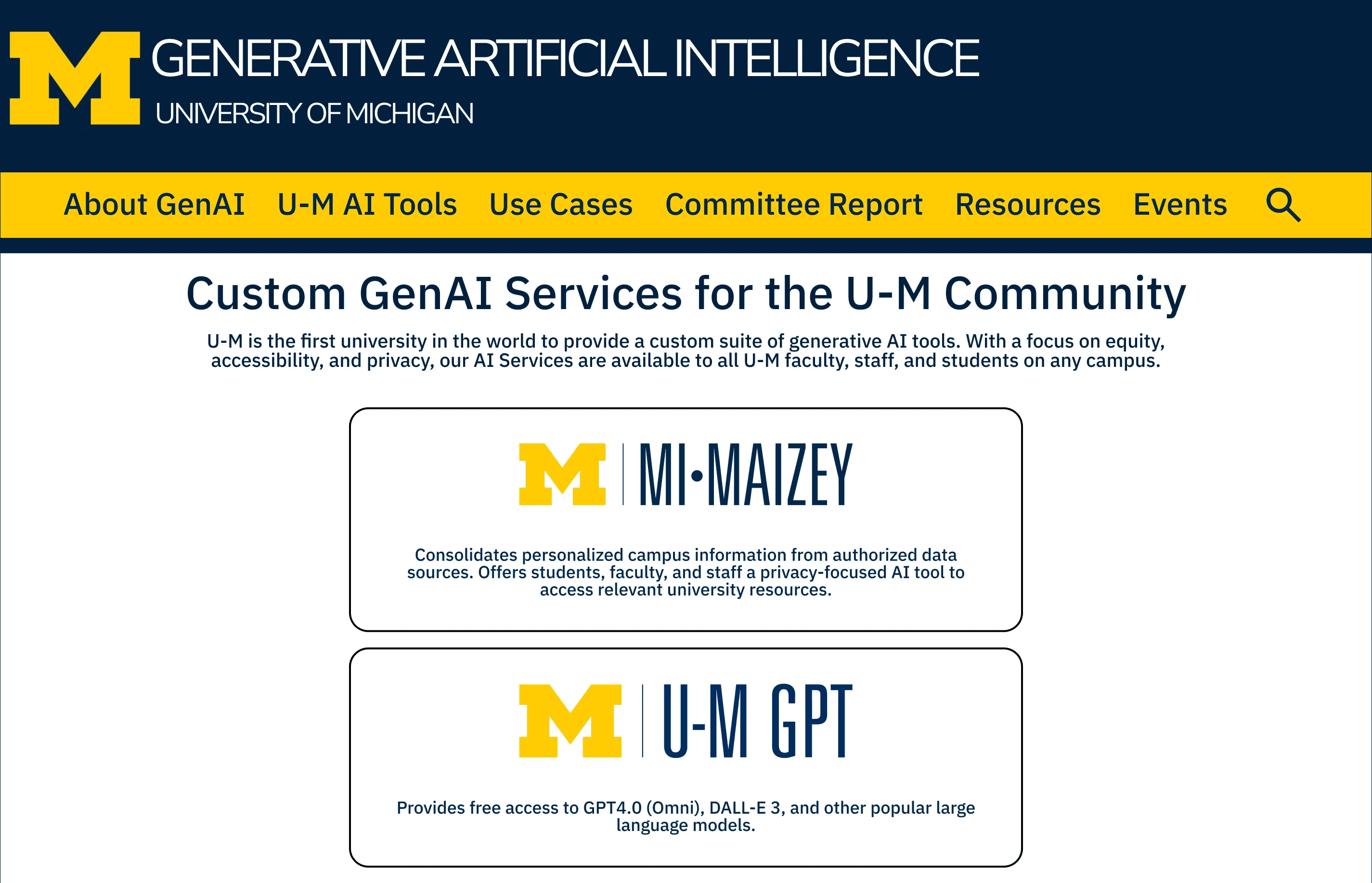
The next major milestone was the development of the landing page. This iteration received positive feedback for its structure and mix of elements. However, feedback from my peers and instructors suggested that it needed more clarity on the product offering, fewer text-heavy sections, and more visuals like product screenshots. They also recommended improving the storytelling aspect to provide better context for users.
The initial landing page received positive feedback for its structure but required refinement.
Feedback highlighted the need for clearer product offering, reduced text, and the addition of visuals like screenshots.
Recommendations emphasized improving storytelling to provide better user context.
The next major milestone was the development of the landing page. This iteration received positive feedback for its structure and mix of elements. However, feedback from my peers and instructors suggested that it needed more clarity on the product offering, fewer text-heavy sections, and more visuals like product screenshots. They also recommended improving the storytelling aspect to provide better context for users.
Prototype Iterations
Prototype Iterations
Prototype Iterations
First Prototype Iteration
First Prototype Iteration
First Prototype Iteration
The first high-fidelity prototype iteration and accompanying presentation deck refined Mi.Maizey's design to better communicate its value proposition and improve visual flow.
The first high-fidelity prototype iteration and accompanying presentation deck refined Mi.Maizey's design to better communicate its value proposition and improve visual flow.
The first high-fidelity prototype iteration and accompanying presentation deck refined Mi.Maizey's design to better communicate its value proposition and improve visual flow.
I created user flows to map interactions, then built wireframes for layout and functionality. Through iterative testing, I refined the designs into high-fidelity prototypes, focusing on usability and visual consistency. There was a particular focus on visual design elements such as color contrast, typography, and interactive features (because of user feedback from usability testing). I also created a presentation deck for my first high-fidelity prototype in order to highlight the key design decisions and their rationale. The deck covered the problem statement, three key design decisions (FAQ search bar, credibility indicators for data sources, and instant support resources), and their respective impacts on improving the user experience and addressing the identified issues.
I created user flows to map interactions, then built wireframes for layout and functionality. Through iterative testing, I refined the designs into high-fidelity prototypes, focusing on usability and visual consistency. There was a particular focus on visual design elements such as color contrast, typography, and interactive features (because of user feedback from usability testing). I also created a presentation deck for my first high-fidelity prototype in order to highlight the key design decisions and their rationale. The deck covered the problem statement, three key design decisions (FAQ search bar, credibility indicators for data sources, and instant support resources), and their respective impacts on improving the user experience and addressing the identified issues.
Final Prototype Iteration
Final Prototype Iteration
Final Prototype Iteration
My final high-fidelity prototype addressed key challenges by implementing a new sidebar for navigation, and incorporating UI elements to openly convey Mi.Maizey's capabilities and limitations.
My final high-fidelity prototype addressed key challenges to openly convey Mi.Maizey's capabilities and limitations.
My final high-fidelity prototype addressed key challenges by implementing a new sidebar for navigation, and incorporating UI elements to openly convey Mi.Maizey's capabilities and limitations.
A major challenge in the final step was balancing personalization with strict privacy restrictions. To solve this, I developed a robust sidebar mechanism that enables personalized content while also emphasizing the importance of navigation on the platform. The sidebar allows users to easily access FAQs, data sources, and their recent search history. Another problem was effectively communicating Mi.Maizey's capabilities and limitations to users. I addressed this by implementing UI components that provide context for Mi.Maizey's responses, such as a clear explanation of AI limitations on the landing page. These changes were directly prompted by user feedback on the value of transparency. This iterative method yielded the final design, which addressed the major problems identified at the beginning of the project and incorporated critical feedback acquired along the design journey.
A major challenge in the final step was balancing personalization with strict privacy restrictions. To solve this, I developed a robust sidebar mechanism that enables personalized content while also emphasizing the importance of navigation on the platform. The sidebar allows users to easily access FAQs, data sources, and their recent search history. Another problem was effectively communicating Mi.Maizey's capabilities and limitations to users. I addressed this by implementing UI components that provide context for Mi.Maizey's responses, such as a clear explanation of AI limitations on the landing page. These changes were directly prompted by user feedback on the value of transparency. This iterative method yielded the final design, which addressed the major problems identified at the beginning of the project and incorporated critical feedback acquired along the design journey.
Most Prominent Changes between the First & Final Prototype Iterations
Most Prominent Changes between the First & Final Prototype Iterations
Most Prominent Changes between the First & Final Prototype Iterations
Home Page
Home Page
The final iteration of the Mi.Maizey primary page incorporated key changes like better organization of features like "Search History," more prominent explanations of AI limitations, and clearer navigation to address user feedback. For instance, the final design also includes an explicit mention of "UM ITS AI Services" which were less emphasized in the first draft, making it a more trustworthy design that better acknowledges the current shortcomings of University of Michigan AI tools.
The final design featured a better-organized layout for features like Search History.
Incorporated more prominent explanations of AI limitations to build trust.
Added explicit mention of "UM ITS AI Services" to acknowledge current tool shortcomings and enhance design credibility.
Before (First Prototype Iteration)
Before (First Prototype Iteration)
Before (First Prototype Iteration)

After (Final Prototype Iteration)
After (Final Prototype Iteration)
After (Final Prototype Iteration)

Response Page
Response Page
In the final iteration, the new 'like' and 'dislike' buttons provide actionable feedback
mechanisms in the response page, which allow users to provide instant feedback and enable continuous improvement of the AI's accuracy. Additionally, a copy button streamlines the user's usage of AI-generated responses to utilize the information provided. These updates reflect a thoughtful response to feedback, enhancing user engagement while improving overall usability.
Introduced 'like'/'dislike' buttons as actionable feedback mechanisms for continuous AI improvement.
Added a copy button to streamline user workflow when utilizing AI-generated information.
These updates enhanced user engagement and improved overall usability.
Before (First Prototype Iteration)
Before (First Prototype Iteration)
Before (First Prototype Iteration)

After (Final Prototype Iteration)
After (Final Prototype Iteration)
After (Final Prototype Iteration)

Profile Page
Profile Page
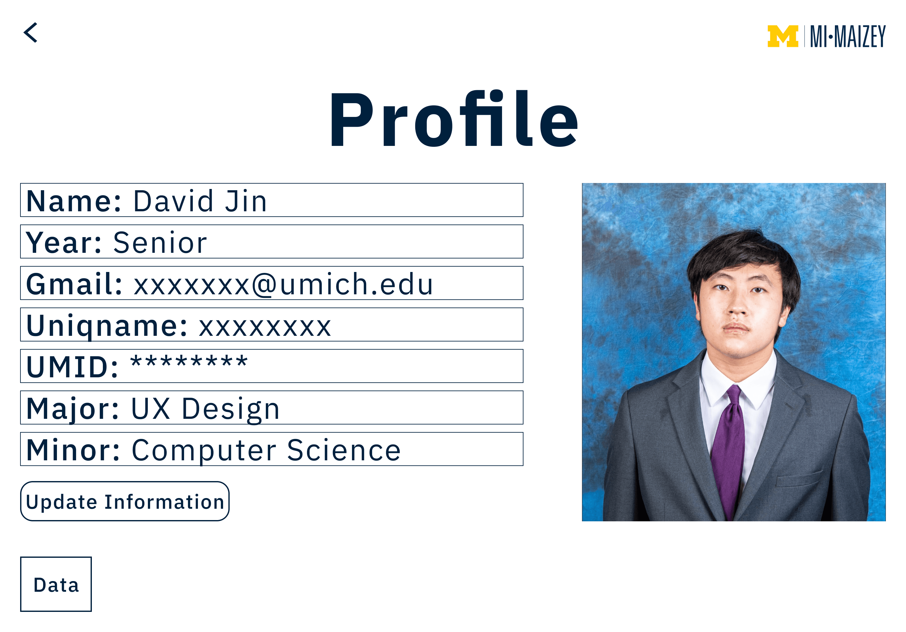
The final profile page improves from the first draft by enhancing content organization and personalization. It introduces the categorized section of "Current Courses," and it provides users with more actionable options like "Update Personal Information." These changes make the design more engaging and aligned with user needs.
Redesigned the layout with categorized sections like "Current Courses" for improved content organization.
Implemented more actionable options (e.g., "Update Personal Information") to enhance user personalization.
These changes resulted in a more intuitive and engaging user experience.
Before (First Prototype Iteration)
Before (First Prototype Iteration)
Before (First Prototype Iteration)
After (Final Prototype Iteration)
After (Final Prototype Iteration)
After (Final Prototype Iteration)

Learnings, Takeaways, and Future Explorations
Learnings, Takeaways, and Future Explorations
Learnings, Takeaways, and Future Explorations
The Mi.Maizey redesign project provided valuable insights into designing AI-powered interfaces for educational institutions. Key takeaways include the importance of clear communication, balancing personalization with privacy, iterative design with continuous user feedback, and flexibility to accommodate diverse user needs within a university community. These lessons shaped the final design and provided experience for future AI and educational technology projects.
Potential future enhancements for Mi.Maizey include integrating additional university systems, implementing machine learning for improved response accuracy, and expanding language support. These considerations aim to keep Mi.Maizey adaptable and at the forefront of AI-powered educational platforms, continually meeting the evolving needs of the diverse University of Michigan community.
Key Takeaways:
Importance of clear communication.
Emphasis on personalization with privacy.
Iterative design based on continuous feedback.
Future Enhancements:
Integrating additional university systems.
Implementing machine learning for better accuracy.
Expanding language support to serve a diverse community.
The Mi.Maizey redesign project provided valuable insights into designing AI-powered interfaces for educational institutions. Key takeaways include the importance of clear communication, balancing personalization with privacy, iterative design with continuous user feedback, and flexibility to accommodate diverse user needs within a university community. These lessons shaped the final design and provided experience for future AI and educational technology projects.
Potential future enhancements for Mi.Maizey include integrating additional university systems, implementing machine learning for improved response accuracy, and expanding language support. These considerations aim to keep Mi.Maizey adaptable and at the forefront of AI-powered educational platforms, continually meeting the evolving needs of the diverse University of Michigan community.
Contact Me
Copyright David Jin 2025

Thanks For Stopping By
© David Jin 2026